
Introduction
Choosing the best banner is not an easy task.
It’s not just about selecting your favorite color or matching some words.
It’s a hard process but it’s super important.
Indeed, if a banner is successful and able to attract high volumes of quality traffic, you’re on the path to achieve a great campaign performance.
I can say that the most important decision you’ll have to make as a media buyer is the choice of ads that are to be placed on each campaign.
In fact, if you’re savvy, you can save money because you don’t need to pay too much to beat your competition and you gain more attention from your target.
In other words:
You can have the best offer, the highest bid and the best-performing target.
However, if you don’t have an appealing banner, visitors will never click on it.
In this article, I’ll give you some key tips that’ll come in handy when you optimize your creatives.
As far as communication is concerned, there are simple adjustments that can solve many of your problems.
Now: A Better Campaign Performance
In order to understand what a good banner is, you need to understand your audience.
Visitors from different countries, cultures and ages will react differently to a banner image.
The same ad, in different countries, won’t have the same performance.
These are some soft display marketing best practices but you can learn more about this subject by investigating online!
You should also brush up on banner design guidelines, bro!
Who’s your Target?
The first thing you should do is set your target.
Who are they?
Are they men?
Women?
Teenagers?
Which language do they speak?
If you’re able to answer these questions you can adjust the copy of the banner, colors, design, and so forth.
You should also try to explore the best sites for banner advertising, of course!
Example 1:

This banner was placed in a campaign targeted to Turkey.
Note that the banner that contained words in the most spoken language of that particular country (banner 2) had better results than the one containing words written in English.
Learn More: Banner Design for Ads: The Definitive Guide
Which is the Spot you Want to Promote?
We all know how to buy banner ads and buy ad space on websites.
But what’s the right spot?
If you put the same banner in different spots you won’t achieve the same performances.
A banner that works very well on the spot 300×250 (for example) may not be as well-performing on the spot 728×90.
The same thing is true when we’re talking about the zone (mobile top, mobile bottom or NTV).
Example 2:
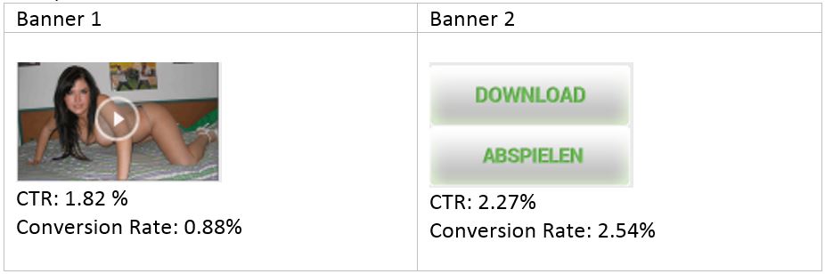
These banners were tested on the Instant Message spot.
This spot is like a chat window that appears at the bottom of the page.
It can be perceived as a notification to the user.
For this specific spot, the banner with texts that induce an action (showcasing the words “download” or “watch now”) worked much better than the one with an image.
Imagine you’re navigating a website.
It’s got a lot of interesting videos and you want to click them to watch what it’s all about.
If an image appears at the bottom of the page, you’ll understand it as a suggestion of related videos.
You wanna watch more content.
On the other hand, if a text appears, you’ll perceive it as an alert message.
This means you’re gonna become immediately prone to click on it.
These tweaks to improve your rates are where web designer software can really help you out!
Where Do you Want to Display your Ad?
Where to place banner ads?
That’s a question that’s been asked quite a few times, for sure!
For some ad networks, you get the info regarding the websites where your banner is shown.
In other words, from the publishers.
If you’re buying your traffic on those platforms, you can surely improve your results.
When you’re creating an ad, the different layouts of websites will require different approaches.
The banners should be incorporated into the website.
That is, they should look like they’re part of it.
Indeed, it should always look natural, as if it belongs on the page.
That’s why you should avoid putting big arrows or crazy animations in a poor attempt to get the user’s attention.
All you have to do is navigate on your top websites, identify your top spots, and then create an image that needs to blend in and never look like a blatant advert.
You should also adapt the color, font size, and ad shape to the look and feel of the website or group of websites.
Example 3:

Banner 2 was created after a thorough analysis of the website in which the campaign was targeted.
In fact, it’s very similar to the videos shown on that website.
If you’re able to do the same, you can definitively expect a better campaign performance.
Conclusion
There are a lot of other tips and banner ad design best practices you can find in a large number of studies regarding this issue.
You can even use Google web designer, check AdSense and understand how Google banners show up to get a sense of how it’s done in the industry and learn from the best.
Nonetheless, these are the most relevant tips and the ones that make you get better results in a short period of time.
Try these tips to improve your campaign’s performance.
I know you’re gonna produce some award winning banner ads.
By the end, you’re gonna need a banner ad revenue calculator to make sure you can keep track of all your awesome revenues!
See Also:
- Banner Design for Affiliate Marketing: The Definitive Guide
- How to Write Banner Ad Copy in Different Languages


Gold mines are those hidden Media Buying treasures that can mean serious profit. Learn how to find one in the Mobidea Academy!

Wanna understand the importance of click-through rate (CTR) in CPM campaigns? Check this post written by an internet marketing expert!

Time for you to go ahead and dive into this analysis of Traffic Factory! Learn the best optimization tips for Traffic Factory right now!