Ecommerce A/B Testing: 7 Tricks to Skyrocket Sales
Last updated on April 2, 2020 8 min read
Sometimes we are stuck with low sales despite the effort we put into optimizing the website, validating ideas, and getting traffic.
The button on the product pages or the pop-up on the landing pages might be the roadblock. Or maybe we are optimizing the wrong pages.
We follow hunches and edit our website based on one hypothesis or another, but what if we’re making a mistake and that plummets sales even more? That’s where A/B testing, or split testing, comes in.
A/B testing for ecommerce is when you show 50% of visitors to your store an alternate version of a webpage to test if the changes you made there resulted in higher conversions. Since 50% of a large number sees one version and the other 50% sees the other, you know which is more effective.
It is one proven way to increase conversions. Netflix constantly changes the cover image of movies. In 2016, they admitted that those user tests play a massive role in conversions.
None of us can deny that this conversion optimization testing absolutely works.
Here are seven A/B tricks to drive sales to your ecommerce store.
7 Proven A/B Testing Tricks for Ecommerce + Bonus
Trick 1. Use Free Shipping To Influence Buying Decision
Lack of free shipping is a primary reason for shopping cart abandonment.
Turn that around with one of the oldest tricks in the book – free shipping. It always works! Whether you are offering free shipping or two for one, something free is a proven way to boost sales.
Tip 1: Offer Free Shipping With A Threshold
If free shipping is a huge cost for your ecommerce business, you can offer free shipping with a condition, for example, “free shipping for orders above $100” or if your customer adds a second item. For ecommerce stores selling to international customers, you can specify free shipping by country or give a discount/free shipping code that reduces the shipping cost for international deliveries.
Tip 2: Hide The Shipping Cost
The second way to go about free shipping is adding the cost of shipping to your product price. If the product costs $70 and the shipping is $7, you can make the product price $77 and ship for free.
Be careful though, because customers will compare product prices with your competitors. If the difference is big, you’ll look like a rip-off, and that will lower sales. To find out what’s the best approach with your users, A/B test the shipping price displayed against the shipping price hidden.
Tip 3: Position Your Free Shipping Right
If you’re not doing anything to make your free incentive stand out, you are missing out big time. Shoppers have to be reminded of it or know about it as quickly as possible. It’s a nudge most people don’t want to miss out on. You don’t have to keep it only on the checkout page.
You can test the size of the text, color, even frequency. Anything that makes it stand out. Test multiple variables but make sure to do it one by one, and not all at once.
Trick 2. Drive Customer Loyalty
One of the fastest ways to beat the competition is to appear better than them in the eyes (and screens) of your customers. Every e-commerce brand should have a competitive advantage.
Here’s a very cool example by a brand called Paperstone. They tested to see if adding their competitors’ prices on 5000 product pages will convince visitors better (because of the obvious comparison) and it worked like crazy. Their add-to-basket and overall conversion rate went through the roof.
Check the results below:
This is the control/original product page.
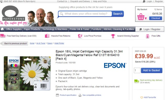
Their first variation was adding only the competition’s prices below their price.

They displayed both versions to 12,000 website visitors but received inconclusive results.
Their second variation, on the other hand, was a success with a 10.67% increase in conversions at a confidence level of 95%.

(Images from VMO)
Their advantage was highlighted against the others, a header text was added for clarity, and the price comparison section was positioned below the button to clear up the CTA’s space for a more resounding presence.
Trick 3. Test The Right Page
Define what you want to achieve from your testing process and direct traffic to the pages relevant to that goal. For sales, you can start testing from the checkout page and go up to impact quick conversions. Be specific as you define your goals.
‘If your goal is simply to “improve your website” or “increase revenue,” you’ll have a tough time figuring out where to start. And at the end of your test, it will be difficult to say for sure whether your test was successful’ – David Zheng.
If you want lead generation, your landing page may be a better starting point than your About Us page. For sales conversion, your checkout and product pages are the top priority.
Choose definable and testable metrics. Sales conversion, email subscription, more clicks on certain CTAs. Those are metrics with a clear purpose that you can test. It all depends on your goals. Also, your visitors’ interactions with the store play a big part. They are the ones dealing with your sales funnel and CTAs, and it’s through them that you get a breakthrough. So study interactions as well.
If you are recording a high cart abandonment rate, then you might want to test the design and copy of your cart page to see what’s the problem. It’s important to avoid jumping to A/B testing the checkout page. Why? Because, if only 2% of visitors continue to the checkout page, this means you’ll only be working with a test pool of 2% of all your visitors. That’s not going to be enough for conclusive data.
Whichever page you’re going to use, you need to be consistent and always test both versions at the same time. Define your testing tools and use google analytics to track and target the right users.
Trick 4. Optimize Your CTA Buttons
The other calls to action on your pages significantly influence the success of buttons, but the design and copy of the buttons themselves are a close second.
Tip 1: Use A Contrasting Color
One legit optimization trick that still works is changing the button color. We’re visual creatures, use this fact.
Here’s an advice: think twice if you’re about to color your buttons red. Yeah, I agree this is the most attention-pinning color, but it might not work on your website, especially if your primary theme is red.
When we talk about colors, it isn’t the exact nuance of the button that creates success for those case studies; it is the contrast with the theme of the site.
There are two types of contrasting colors – complementary or triadic. Complementary colors are opposite your dominant color on the wheel, while the triadic is a third of the way around the wheel.

(Image from OptinMonster)
Tip 2: Use Personalized And Action Oriented Button Copy
Optimizing your headline or copy to show the benefit of your products is very important. The buttons shouldn’t be any different.
Not only should you make it about the benefit, but also make it action-oriented and personalized.
iMPACT tested their button copy and saw a 78.5% increase in conversions after one month.
Control

Variation

(Image from iMPACT)
Another eye-opener comes from Convert Verve. They tested “My” against “your” and the later performed significantly worse than the former with a -24.95%.
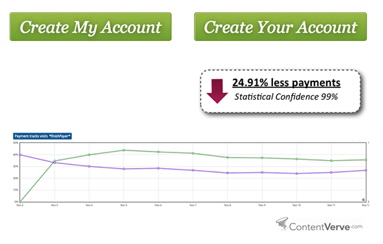
That insight led to more testing on other websites and landing pages with consistent results. The most dramatic of them was a 90% increase in click-through rate on Unbounce.

(Images from Unbounce)
Tip 3: Make It Big
Increase conversion rates with smooth user experience by making your important buttons big. Visitors should never have to look for it. It should be as apparent as a cat with three eyes. If they have to look for the add to cart or checkout button, you failed. The bottom line is that it should be sizeable enough to stand out. A/B test the hell out of this to find the right size for your customers.
Trick 5. Optimize The Category Pages
Ecommerce success comes from creating a seamless shopping experience. Having nice aesthetics may work for your About Us page, but your Product Category page should be more about UX than aesthetics. So images, copy or videos popping out in random places might be a deal breaker. To be sure, run the test.
SmartWool and Blue Acorn thought that coming up with a unique and aesthetically pleasing category page will lead to more conversions. The design showcased images in varying sizes. After a while, they tested that design against the usual grid design.

(Images via Optimizely)
The emphasized images recorded more clicks but not sales. It’s true they were eye-catching, but complicated or delayed finding the products users were looking for. The repetitive design, on the other hand, made scanning the page easier, allowed better eye tracking and enabled faster purchasing decisions. There was simply less noise.
Trick 6. Test Sliders
As a format, the slider provides more space (fits more offers), so I wouldn’t be surprised if you want to have one on your site. After all, sliders work so well for many businesses.
But here’s a dark secret that could make you reevaluate your enthusiasm.
First: Carousels on ecommerce stores are a usability nightmare. To start with, they don’t show well on mobile devices and affect speed and performance. Mobile friendliness and website speed are two major e-commerce fundamentals that you must not ignore. Check this ecommerce web dev checklist if you don’t believe me.
Second: People might get annoyed or distracted by them in the midst of an important task. Remember that too many messages equal no message, and people like to ignore sales banners.
Considering the impact of sliders on conversion rates, it’s essential to use A/B testing for ecommerce websites to see if their absence or presence will increase conversion rates. You could also check if manual or automatic sliders perform better. Other things to consider are images and copy placement on the sliders, copy to image contrast, and so on.
Trick 7. Go Against Popular Myths
So many studies swear by the number 9 for product pricing. Walmart follows the number 9 thing, and so many others are falling for its charms. There’s also the number 7. The myth is that charging 99.97 or 99.99 over 100 will make a difference.
While it may work for some stores, many in the industry think it’s phony. I read a study once about how online scammers use the number 7 a lot.
Groove found out that using 7 and 9 made no difference with their conversion rates. The results were inconclusive because there were no changes in customer behavior.
(Image from GrooveHQ)
Resorting to case studies is great for exploring ideas and approaches to split-testing, but it might not be enough to explain all aspects of your users’ behavior. What to do in this case?
Apply common sense!
What works for another ecommerce business might not work for yours. Instead of pulling the 9 or 7 tricks, try a price flexibility model. Your customers might respond positively to a multiple-choice option or a comparison between a high priced option against a cheaper one.
You can even read through customers comments, polls, reviews or use a survey tool to ask visitors for feedback on your website and build up from there.
Be weary of rushing to test every claim and myth online. Do your homework first, gather data, analyze and always test with your customers in mind. Knowing your audience is the biggest sales booster there is.
[Bonus] Run A/A Tests
It’s good to check the calibration of your testing tools from time to time just to be sure. This is where an A/A test comes into play. Test your landing page against itself with the same tool on a typical season and see if the conversion rates are similar. If they aren’t and everything else seems in check, your software might be off.
Conclusion
Some of the biggest ecommerce success stories happened thanks to A/B testing.
However, one test can never be the magic bullet that solves your revenue issues. Consistency is key. If you want to achieve the kind of success that Netflix or Amazon are getting from A/B testing, you’ll need to have an ongoing, incremental, and iterative testing process that builds upon the results of each previous test.
The end game of A/B testing is to understand your audience better. To know what makes them tick… or in our case – what makes them click!
Remember: everybody has soft spots! Dig deep, experiment, and you’ll find them for your potential customers!


Apply these top landing page optimization tips today and watch your numbers grow in no time!

Learn how to effectively optimize successful campaigns on Ero-Advertising, one of the affiliate industry's best-known ad networks!

Is setting up CDN, Hosting and Domain still a mystery to you? Check how you can make it all happen by following these super quick steps!